Data visualization is an essential part of a data scientist’s job. Visualizing data helps the viewer find complex patterns in the data. Sometimes just graphs like pie charts and bar charts do the jobs but sometimes one does feel a need of annotating data points. You may stumble upon cases where data points are very close to each other in such situations it becomes annotating data (signifying data points with text) illegible. To make annotation even more clear and prettier we can use adjust_text an amazing library I found while rummaging cool ways to annotate data.
Annotation Snippet using Matplotlib
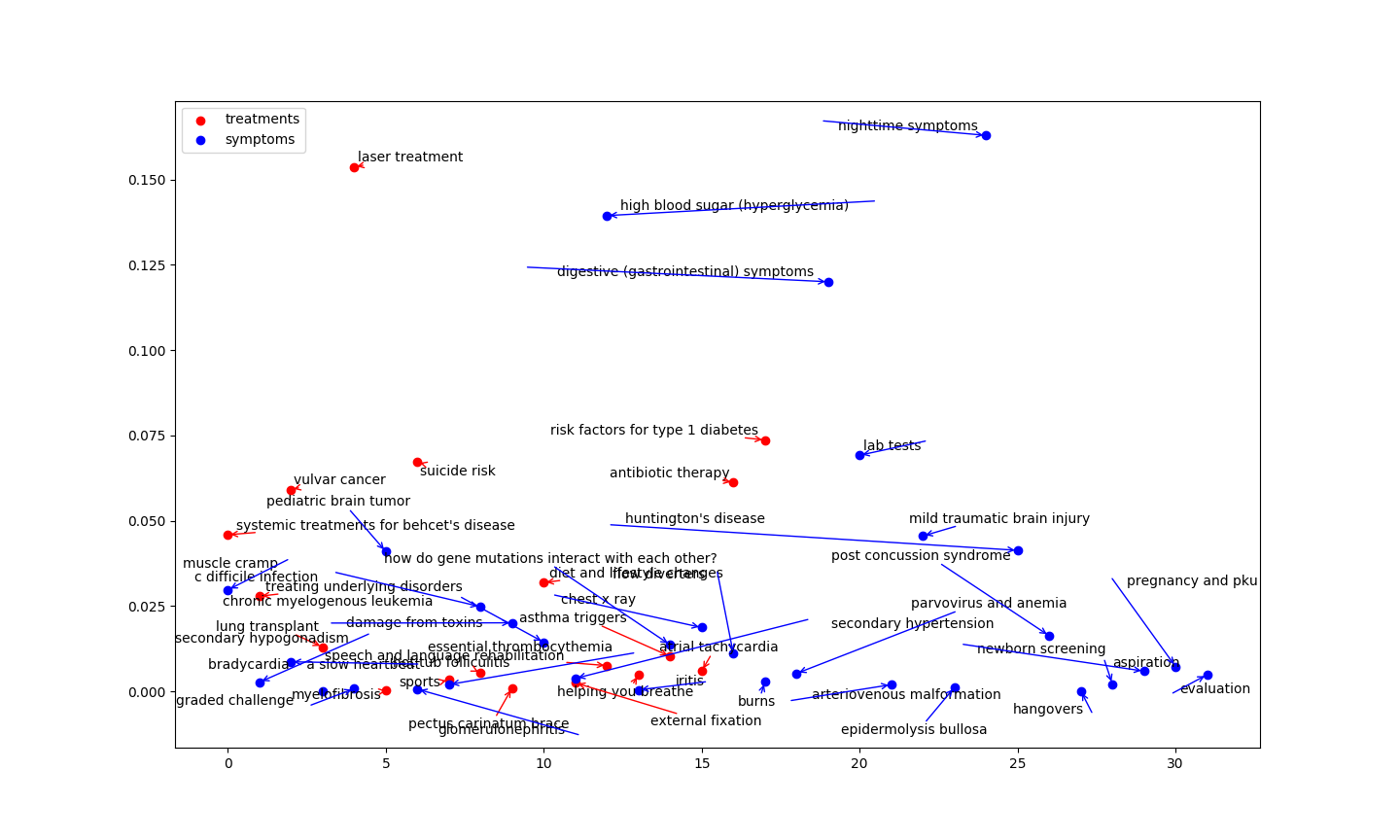
Somewhile ago I developed a classification algorithm to classifiy textual data into symptoms and treatments. The code plots the data points and annotates them in a clean manner
import matplotlib.pyplot as plt
from adjustText import adjust_text

treat_list = list(treat_dict.values())  # list containing confidence value of a text being treatment
treat_dict_range = range(len(treat_list))

fig, ax = plt.subplots()
plt.scatter(treat_dict_range, treat_list, c='red', label='treatments')
texts = [plt.text(treat_dict_range[i], treat_list[i], list(treat_dict.keys())[i]) for i in range(len(treat_list))]
adjust_text(texts , arrowprops=dict(arrowstyle='->', color='red'))


sym_list = list(sympt_dict.values())  # list containing confidence value of a text being symptom
sym_dict_range = range(len(sym_list))

plt.scatter( sym_dict_range, sym_list , c='blue', label='symptoms')
texts = [plt.text(sym_dict_range[i], sym_list[i], list(sympt_dict.keys())[i]) for i in range(len(sym_list))]
adjust_text(texts , arrowprops=dict(arrowstyle='->', color='blue'))
The final plot looks like this